

Enclose The Checkout to Reduce Checkout Abandonment
Struggling to get customers to complete checkout? You’re not alone. Checkout abandonment is one of the most persistent problems for ecommerce merchants across industries.
In fact, studies have shown that most ecommerce sites experience a checkout abandonment rate between 40-60 percent – meaning roughly half of all customers who make it to checkout leave before completing the first step.
Half of all customers who make it to checkout leave before completing the first step.
That’s a lot of lost revenue, which is why optimizing your checkout for user experience is so important. We have two major recommendations: keeping everything on a single page with our BigCommerce One Page Checkout and implementing an enclosed checkout process
What Is An Enclosed Checkout Process?
“Enclosed checkout” is a web design term for a checkout that includes the checkout itself, a logo, trust and security badges, and nothing else. A enclosed checkout does not share the same layout or header and footer as the rest of the site. The goal is to make the user feel like they’ve entered a “closed off” area of the site, not simply navigated to another page.
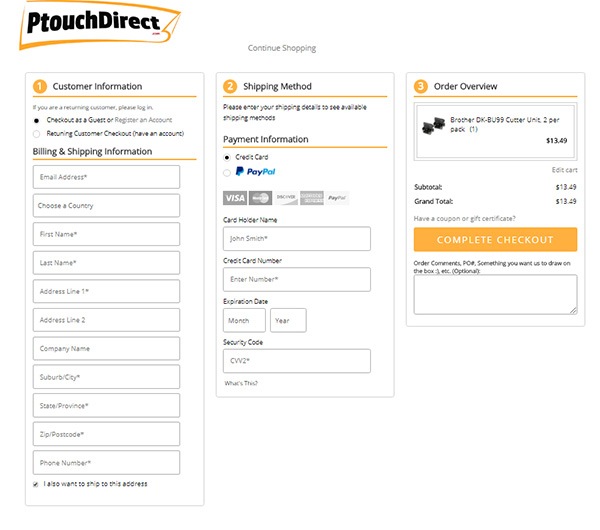
Here’s an example from one of our clients. As you can see, this checkout is very plain and minimal. The only branding is the logo at the top and the navigation elements (navigation bar, left-hand menu), as well as the upsell features that appear across the site, have been removed.
It might look basic, but that level of simplicity is important for usability. While it’s important to maintain consistency and branding across your site, the checkout page is the one place where you don’t want to do that. By stripping the page down to its basics, you help keep customers focused on buying.
“Enclosed checkout” is a web design term for a checkout that includes the checkout itself, a logo, trust and security badges, and nothing else.
Benefits of Enclosing the Checkout Process
Prevent Distractions
By the time they’ve reached the checkout, your customers are done shopping. You don’t want to distract them with navigation elements or anything that could take them off the path towards conversion. A sparse checkout page is a visual cue of what they came to do: make a purchase.
Make It Easier To Buy
Removing distractions helps customers focus. An enclosed checkout makes it easier to focus on completing the steps of checkout. Customers can double-check what’s in their carts, enter shipping details, and select options without getting overwhelmed by visual stimuli.
Showcase Important Details
By minimizing the amount of text, your customer is able to focus on security certifications or shipping deals, increasing their positive impression of your site.
Need Help With Your Website’s UX?
Want to optimize your BigCommerce store for conversions? Whether it’s checkout, category structure, or homepage design, our UX experts can help you make the changes to land the sales you need. If you’re ready for a free consultation on how to win more sales, call us today at (866) 590-4650!