
The original Madden & Madden site was well designed but needed an update to effectively compete with most modern websites.
The coding practices in use were good at the time the site was created but are now outdated. Most modern sites use CSS instead of table based layouts, which has been the web standard for a few years. You can create a lot of interesting media using flash but they will most likely not provide any ranking benefits for your site, because the search engines need content they can understand. So your flash files would need supporting text/code to make it a ranking factor for your site.
Issues with the old site
- Table based layout
- Flash Slideshow on the home page
- Old HTML coding practices that increased page size and load speed.
- Difficult to update, due to the amount of images they were using.
- The Copyright date on the site was 2007.
- Used the same title and meta description for all pages.
All of these issues affect SEO and SERP rankings in some way. Flash files cannot be read by search engines so their purpose and relevance is lost. Sites with clean and more up to date coding syntax are preferred by Google and the less time it takes for the site to load the better.
Madden & Madden wanted the most cost effective way to handle redesigning their site. After deciding to move the site on to WordPress they found a premade template that we customized to match their design and functionality requests.
Our redesign of the site did more than just update the color scheme and layout to have a more modern look. The flash slideshow was replaced with a custom image slideshow using jquery that search engines will be able to read and recognize. Moving the site to WordPress gave them numerous benefits including making it easier to manage and update, and access to blogging capabilities.
Here are some key differences in the Redesign
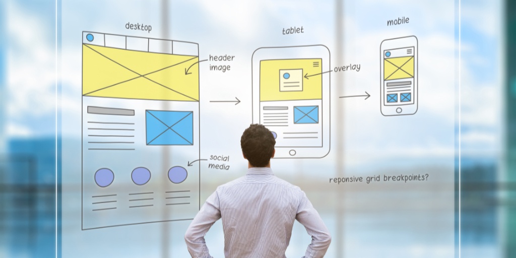
- The site uses responsive design to scale the content properly based on how the site is being viewed (computer, mobile, tablet). This optimizes the site and changes how it looks based on the viewing space available on the device. Using a responsive design is better than having a separate mobile site, since it is easier to update and doesn’t increase the amount of work you would need to do.
- The address and phone number in the header are interactive. Clicking on the Address sends you to Google maps, while mobile browsers can click on the telephone number to call the business directly.
- The meta information was completely revised and updated to help the site rank better.
- Set up Google Analytics and Webmaster tools tracking to help with future site improvements.
All of these updates will help the site gain more exposure and make it more competitive in the SERPS. Interested in moving your site to WordPress or converting to a mobile friendly/responsive design? Then contact us to get a quote.


