
We recently wrapped up a project for Water Bobble, owned by Seventh Generation. They had an eCommerce website on the Magento platform, but were unsatisfied with the overall experience. While Magento is a very powerful eCommerce platform, it proved to be too expensive and difficult to maintain by their in-house team.
Water Bobble was looking for an eCommerce platform that was not only in their price point, but easy to use with excellent support. We recommended BigCommerce, and then took it a step further.
Because a large part of their clientele uses cell phones and tablets to navigate through their site and purchase products, we recommended taking on the the new design with a mobile first approach.
The mobile first approach in this instance, meant going with a responsive design. Responsive Design is the best way that we currently have to ‘future-proof’ websites. It is the best way to maintain a consistent appearance cross browser & devices by essentially resizing the design depending on the browsers size.
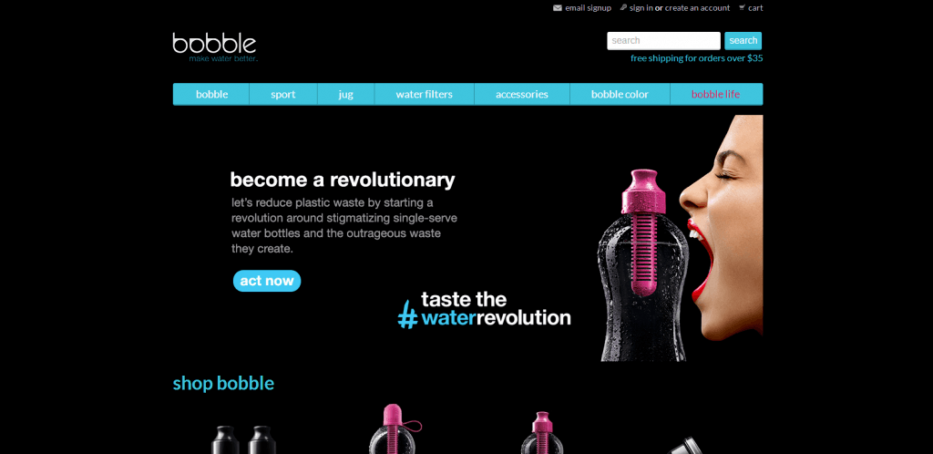
Water Bobble as seen on a desktop:

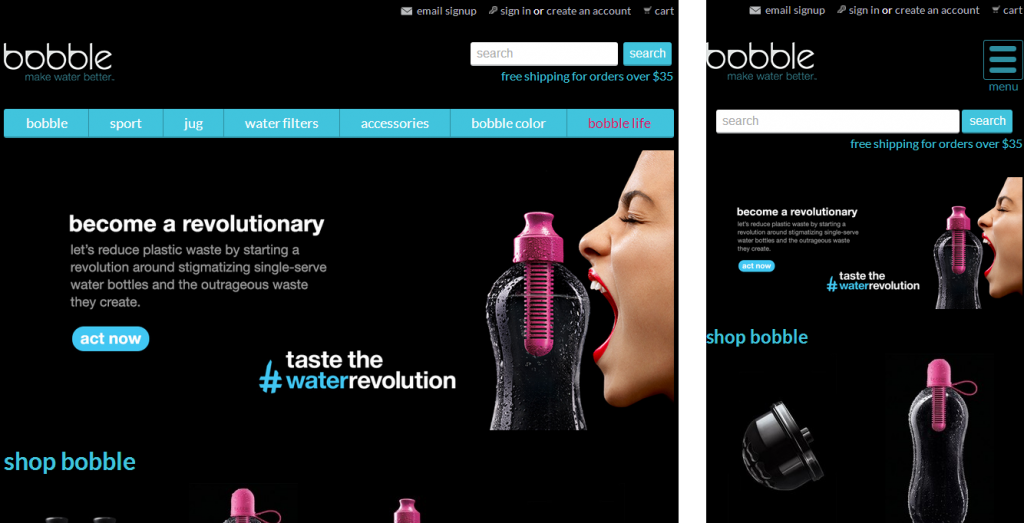
Water Bobble as seen on a tablet and mobile device, respectively:
Designing responsive eCommerce sites is not an easy task. When creating a responsive design for a more ‘static’ website (such as a WordPress site), we have much more flexibility and control over our output. However on an SaaS platform such as BigCommerce, we are constrained within their variable guidelines.
This, however, is not always a bad thing. For example: because they have certain variables available certain places, we know not to design for the same thing under 5 different unknown circumstances.
Nonetheless, it does complicate the design process to account for the list/category display of products across any device size. With mobile design, as with any eCommerce design, the Product Page will be the most important. While the Call to Action may be up close to the top on desktop devices, we need to ensure that the Call to Action maintains the same flow on mobile, without being pushed too far down the page.
In the case of Water Bobble’s site, to avoid pushing the Add to Cart (the call to action on the product page) too far down, we ended up moving the quantity options up and displaying them horizontally on mobile, rather than vertically, as they are on desktop.
This is just one simple example of the countless things that need to be discussed and thought through when designing for responsive eCommerce sites. That said, even though responsive design poses it’s own specific set of challenges, it is without a doubt the best thing you can do for your site right now.
Google recommends responsive design for it’s algorithms and if that isn’t reason enough to start, in an increasingly mobile dominated web, you’re losing customers if you aren’t giving them a website they can navigate and purchase from on a phone, tablet in addition to the standard desktop.
Ready to get started? Get in touch and we can start discussing your responsive options!


